Keysign
I turned an engineering-led prototype into a clear, scalable tool that helps agents handle the new paperwork that came with the 2025 NAR settlement.
- 0 to 1
- End-to-end
- B2B
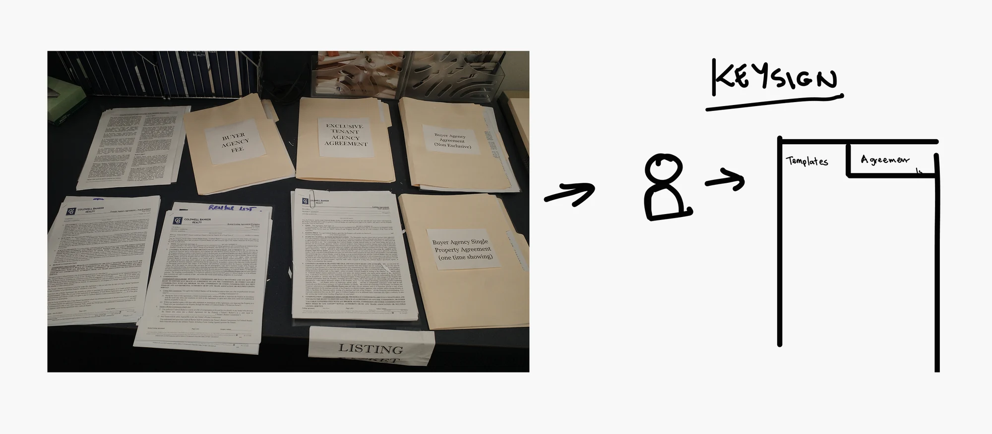
After the NAR settlement, every showing needed paperwork, legal disclosures and documented consent. Agents were printing templates, filling them out, scanning them and waiting on a signature before they could show a home.
Engineering had already built a mobile prototype. Instead of starting over, I made what was there clearer and more scalable, with small changes that didn't need back-end work.
Scrappy prototype to scalable CX
Engineering built a mobile-first prototype where agents could complete templates and send agreements to buyers for signature through DocuSign. UX joined later. The CTO wanted to test it with real agents within three months, and the design teams were at capacity, so I took ownership of the design and led the effort to launch while still supporting my teams.
How might agents draft paperwork more efficiently and clearly, without rebuilding the app from scratch?
Time-cruuuunch
The prototype mapped every field from the agents' DocuSign templates into one mobile form. In real use, an agent working across several metro areas found it overwhelming. It also needed to pass accessibility and content reviews and move from Material UI to our design system.
Engineering had built the foundation on a tight timeline, so any design change had to protect delivery dates. Research time was limited, so I aligned with product on user insights and business goals, studied the legal and compliance requirements, and worked with design leadership and accessibility partners.
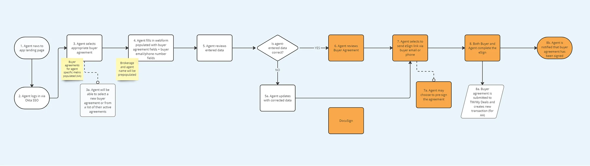
Workflows for busy agents
Agents fill out forms in their cars or in front of a house with buyers waiting.
An agent might show homes in Seattle, Bellevue and Tacoma, each with its own templates and rules.
The tool should help the agent's workflow, not get in its way.
There was no time to rebuild, so I focused effort where it mattered most.
If it worked, it would become a core feature of the agent platform in development.
Working within tough constraints
The trickiest part was working within the technical constraints. I looked for changes that would make a real difference without adding back-end work or pushing the timeline.
Templates and agreements, separated
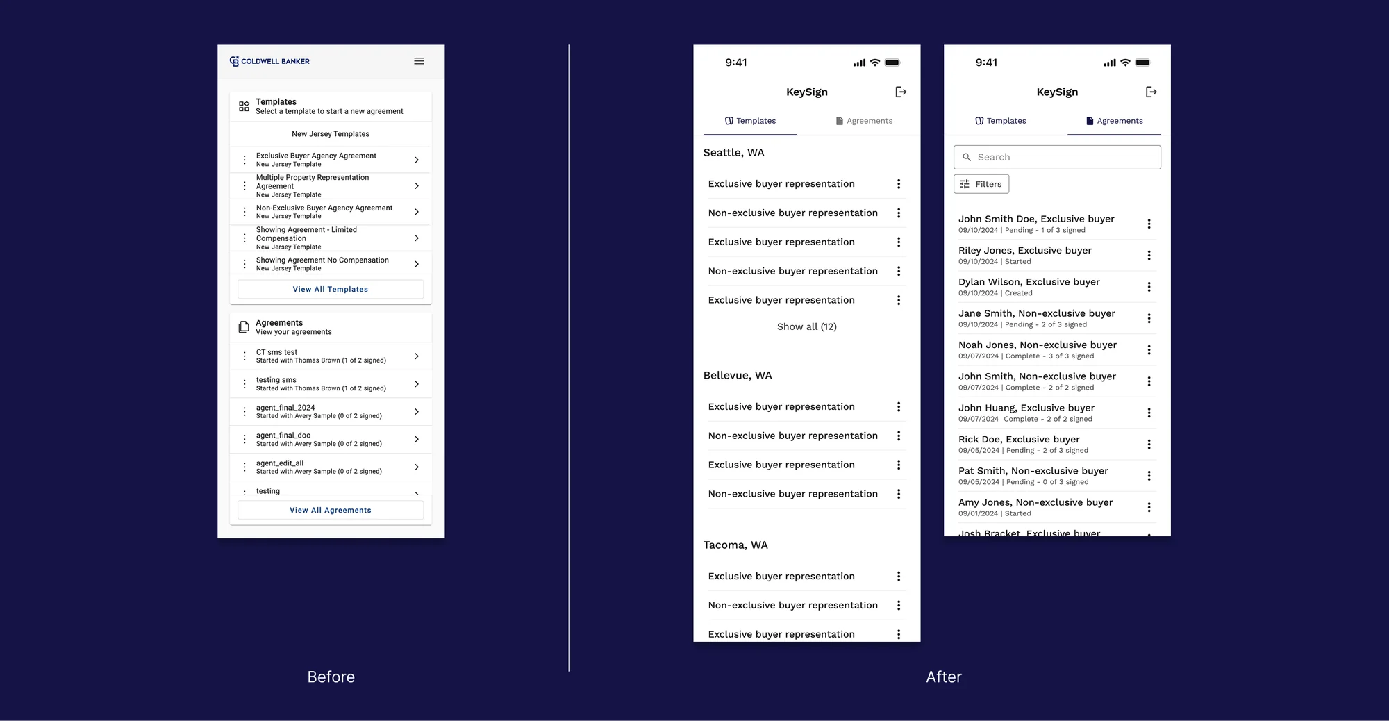
Splitting Templates and Agreements into tabs was a low-effort change with a big usability gain.
The second buyer
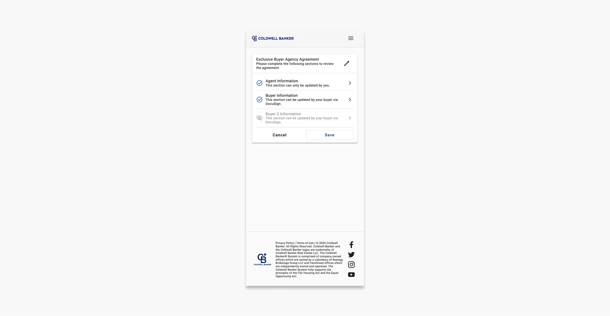
In the original, adding a second buyer meant finding a grayed-out icon at the bottom of the list, opening it and switching the form on with a toggle. Not intuitive.
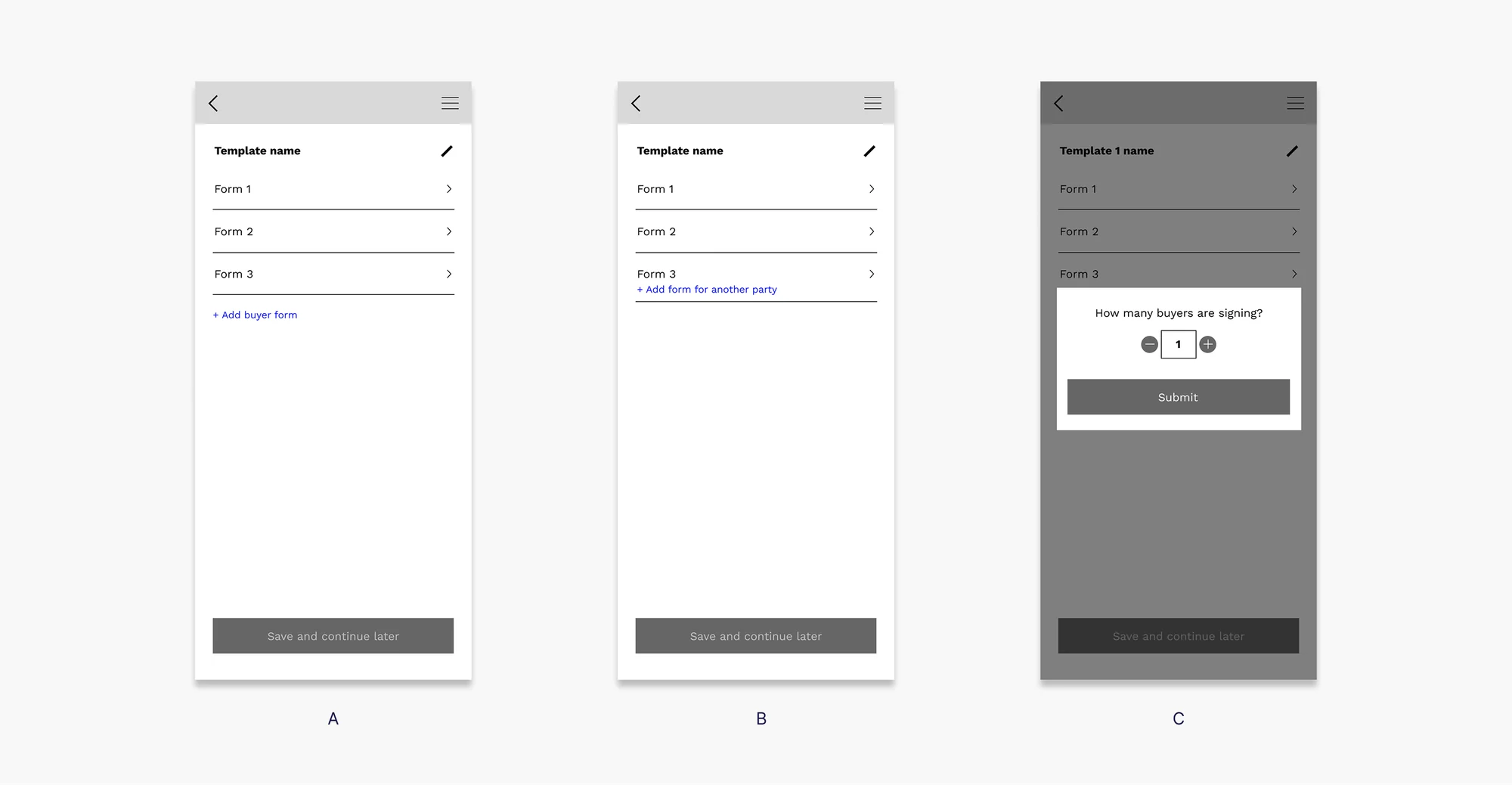
I explored asking upfront how many buyers there were, an Add button and dynamic fields. Engineering needed back-end changes for all of them, and there wasn't time.
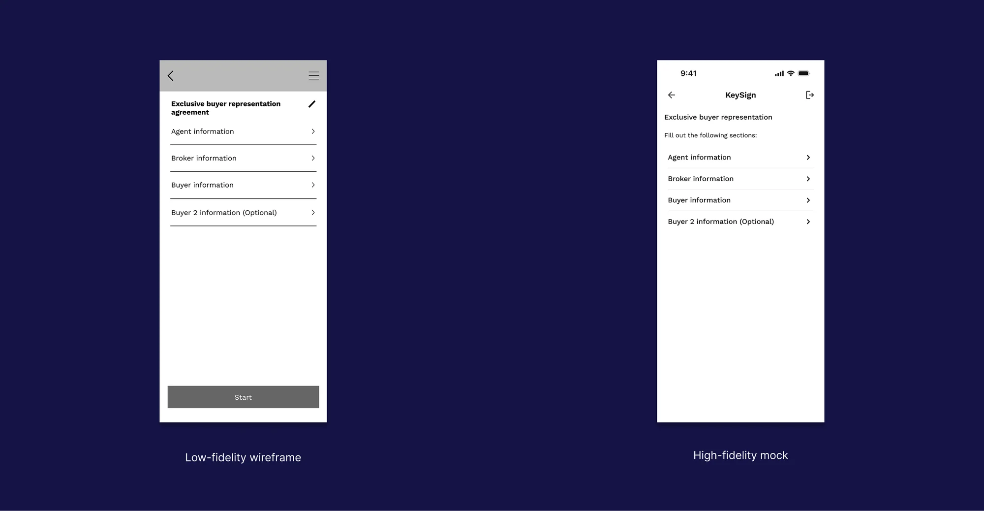
So I stepped back and proposed a copy change: (Optional) next to the second buyer's section. No logic changes, no new components, no back-end work. Product and engineering loved it, and it worked.
Ready for launch
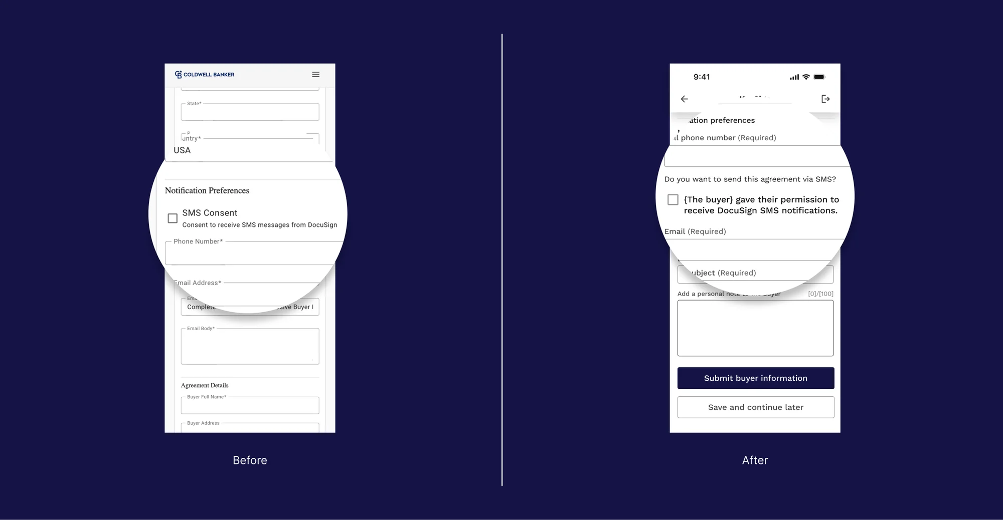
The final experience kept engineering's architecture but changed how agents move through it. Known information pre-fills, and better filters make agreements easier to find.
Engineering added a way to take or upload a photo of the buyer's ID to fill in fields, and the UX writer made sure every instruction was clear. Because agents consent on the buyer's behalf, we wrote that language together so it would pass legal review.
After launch
Agents review, approve and send the agreement to the buyer through DocuSign. Based on their feedback, and with engineering on board, agents can now sign directly in the app instead of detouring into DocuSign.
The impact
Agents reported lower cognitive load, with fewer errors and less back-and-forth with buyers.
Leadership saw the value right away, and Keysign shipped as a feature of the flagship agent software. For the UX team, it built stronger trust between engineering and design, and a validated path for scaling into agent software.
What I learned
The biggest lesson wasn't about workflows or templates. Great experiences are possible under heavy constraints when clarity, empathy and creativity lead. Being both a design leader and a hands-on problem solver here was challenging and rewarding, and bringing UX in early builds credibility and trust with partners.
Confidential information has been omitted or blurred to comply with my NDA.