Prime Household
I redesigned how Prime members invite another adult to share their benefits, and research showed the real barrier was trust.
- Redesign
- Adoption
- Multi-user
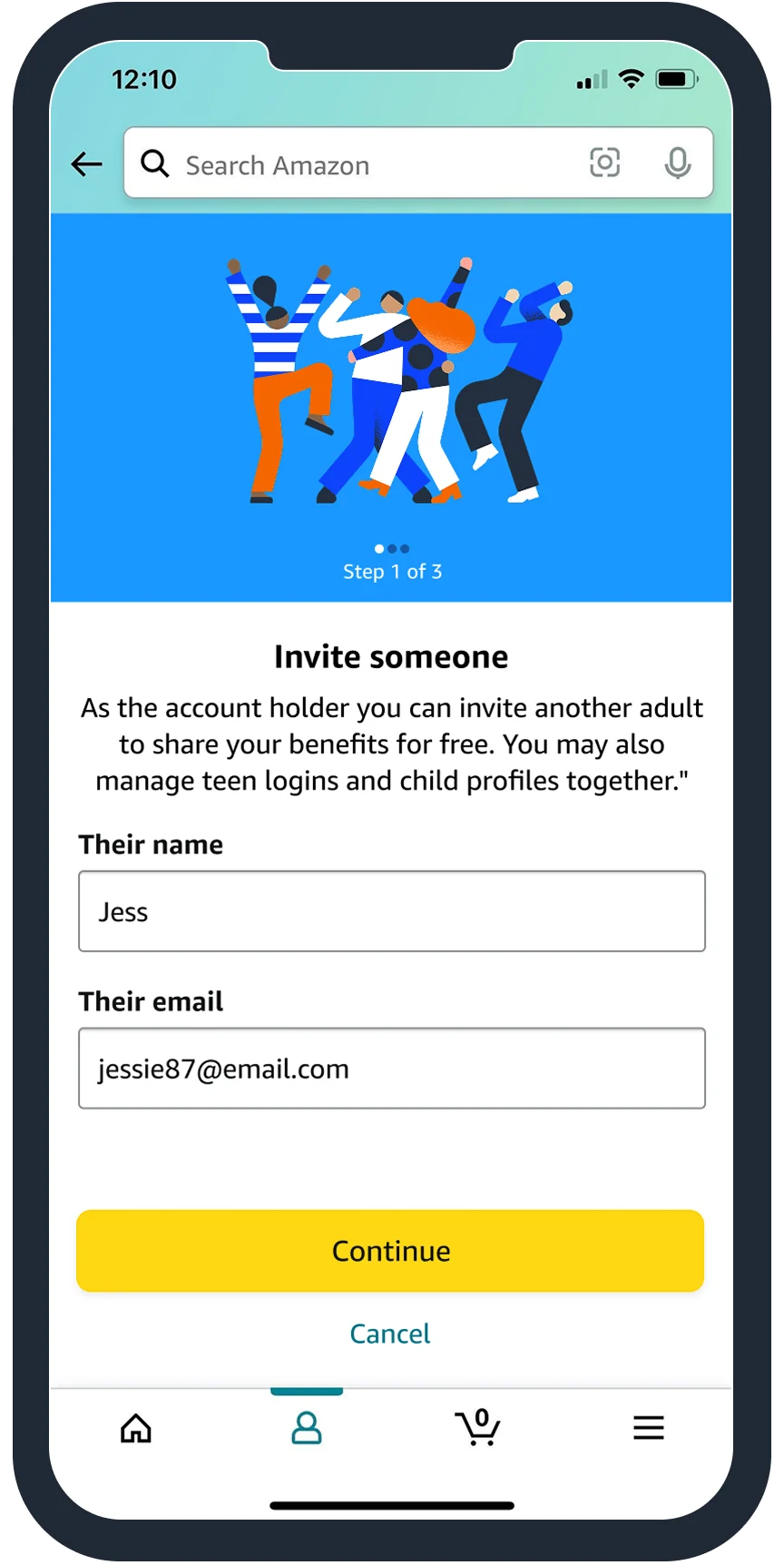
Only 10% of members used Prime's household sharing benefit, and drop-off was high. Earlier product-led experiments hadn't moved the numbers.
I ran a baseline usability test, mapped both sides of the invite and redesigned the flow around setting clear expectations, especially about sharing a wallet.
Improving adoption
Prime members can share their account with another adult, but few did. Customer feedback said the experience was confusing. I worked with a Senior PM, Senior engineer, UX writer, legal and the design systems team to find the real pain points and validate solutions.
Reduce confusion, increase completion and adoption, reduce customer service calls and improve satisfaction.
Getting perspective
I started with a usability test of the existing experience. People abandoned the flow because it lacked clarity, especially when asked to share their wallet, and unhappy paths sent them to customer support.
"What if I want to share my account with my mom or a roommate? I don't want anyone with access to my credit card information."
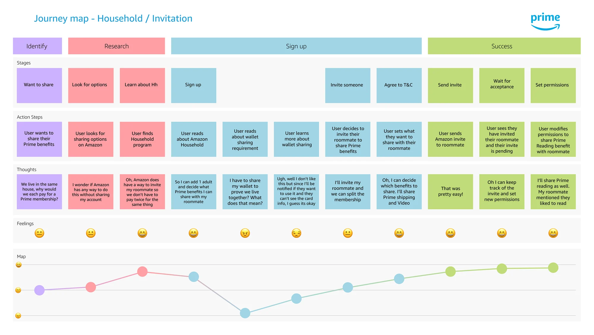
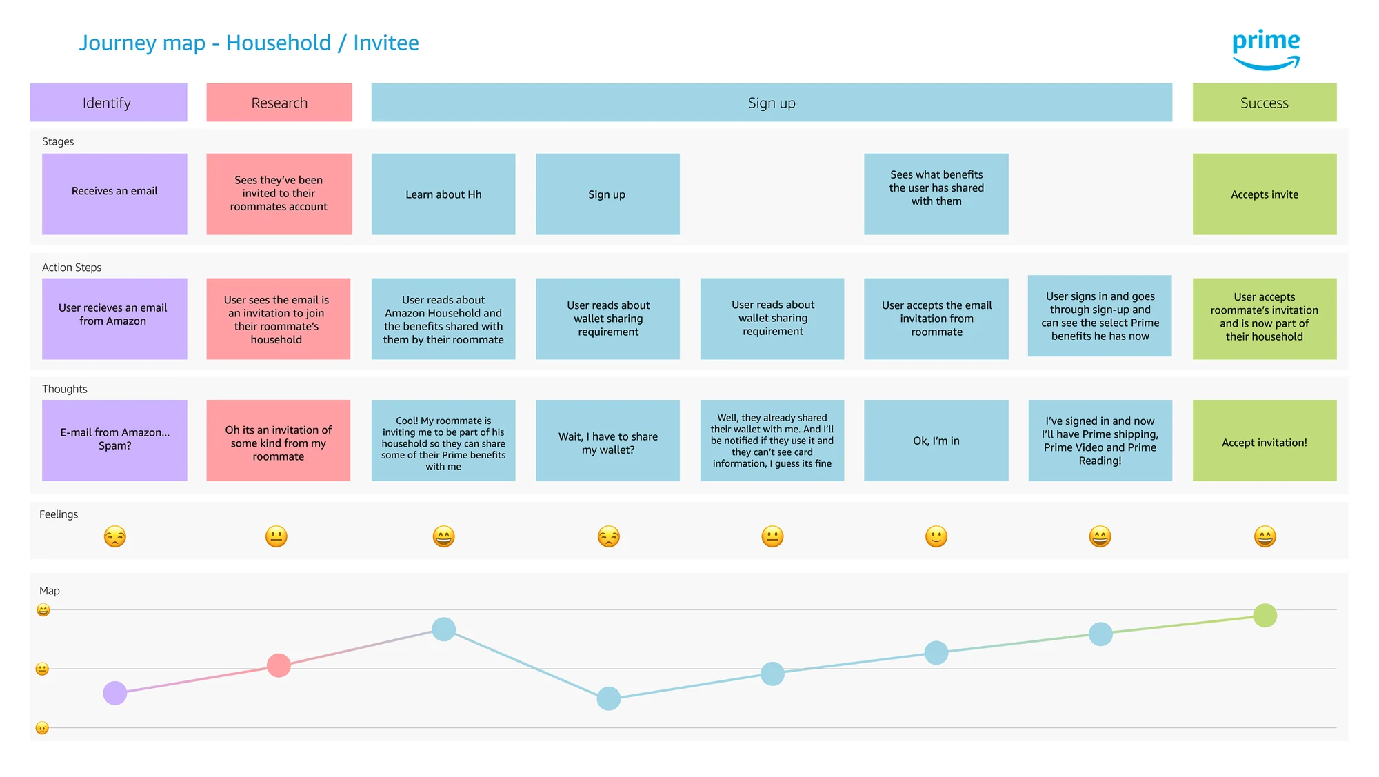
I mapped journeys for both the inviter and the invitee. The friction showed up in the same spot for both, which made it obvious to partners why we needed a different approach.
A new approach
If people knew what to expect, the experience would feel simpler. I redesigned the first screen to explain the benefit and the steps, including wallet sharing, and worked with a UX writer to make the copy digestible.
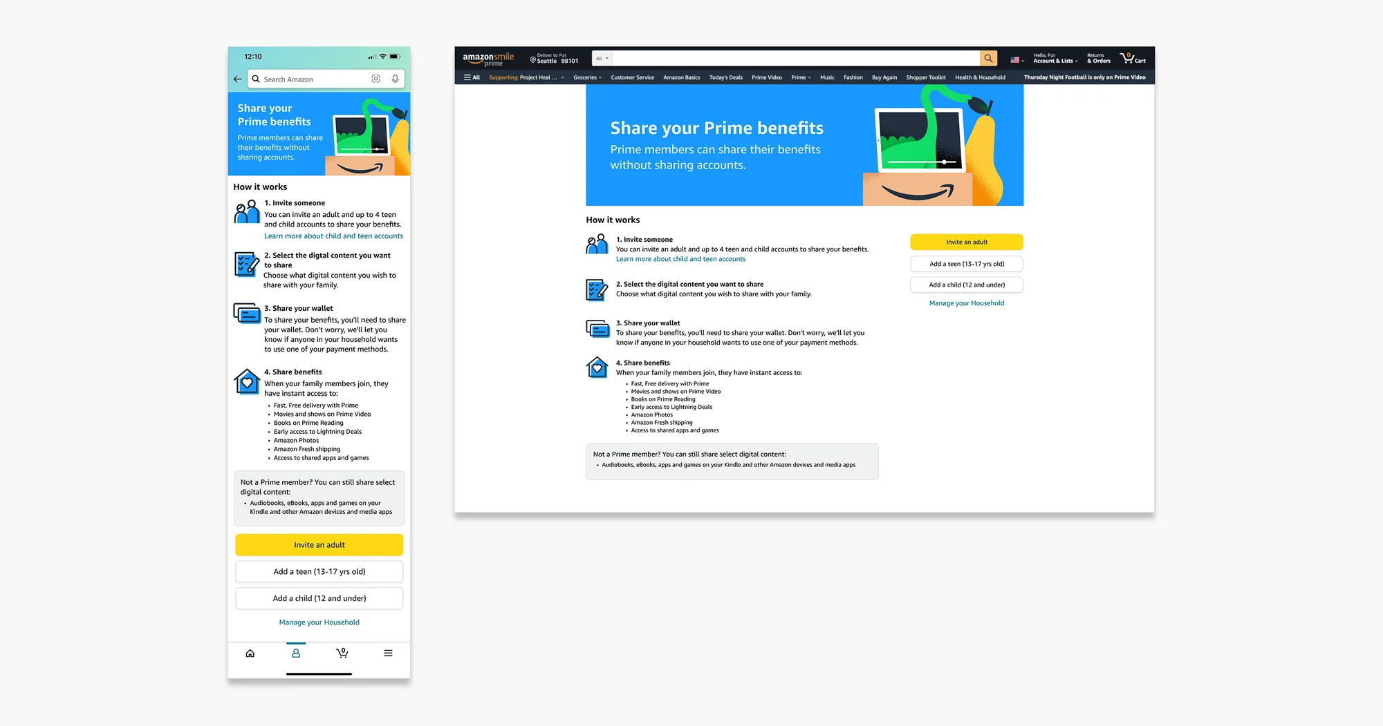
I pitched sharing a single payment method instead of the full wallet. My partners agreed it would simplify things all around.
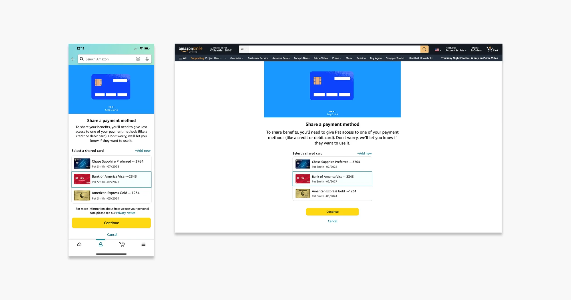
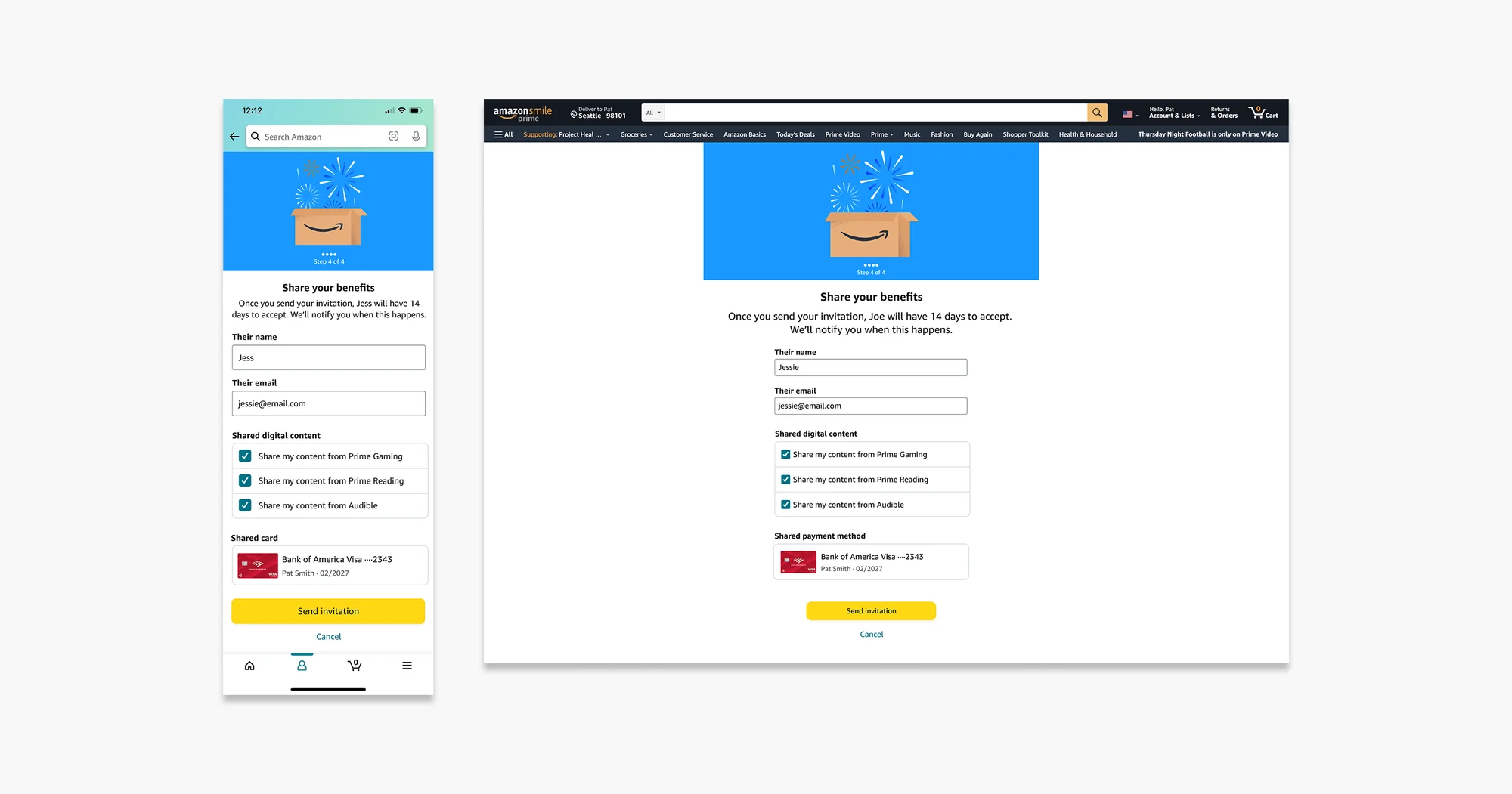
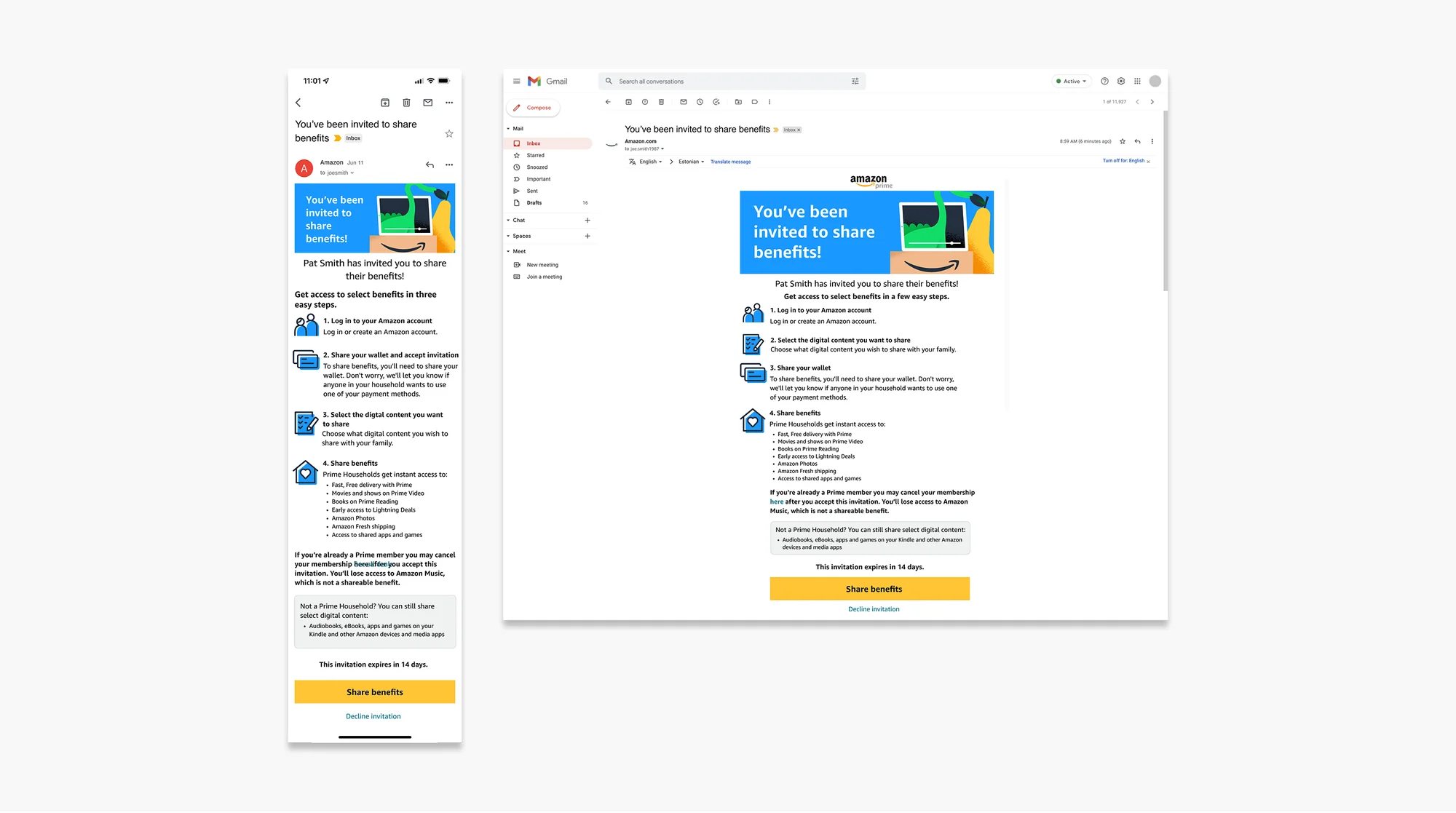
A confirmation screen let people review before sending the invite, and the invitee's email mirrored the same clear steps.
The legal pivot
Just before launch, legal let us know that sharing the full wallet was part of contract terms with content studios. The single payment method couldn't ship, so I pivoted quickly.
Going back to the research, I added a Learn more link with the top 3 questions about wallet sharing, rewrote the messaging with our UX writer and legal, and removed the final review step to shorten the flow.
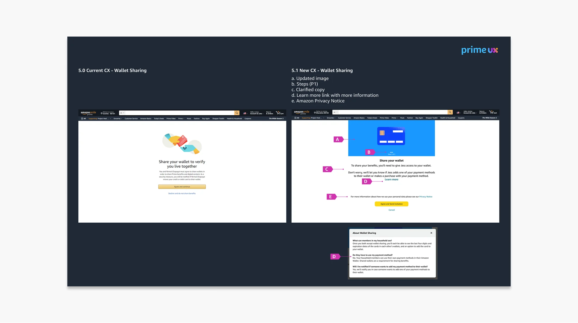
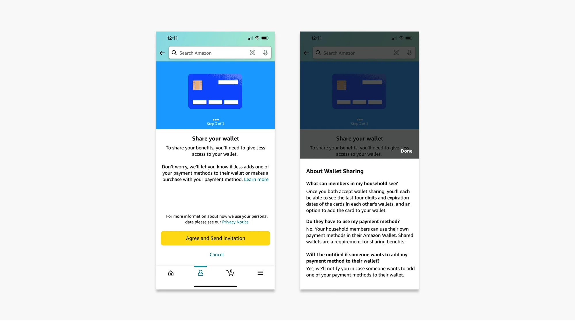
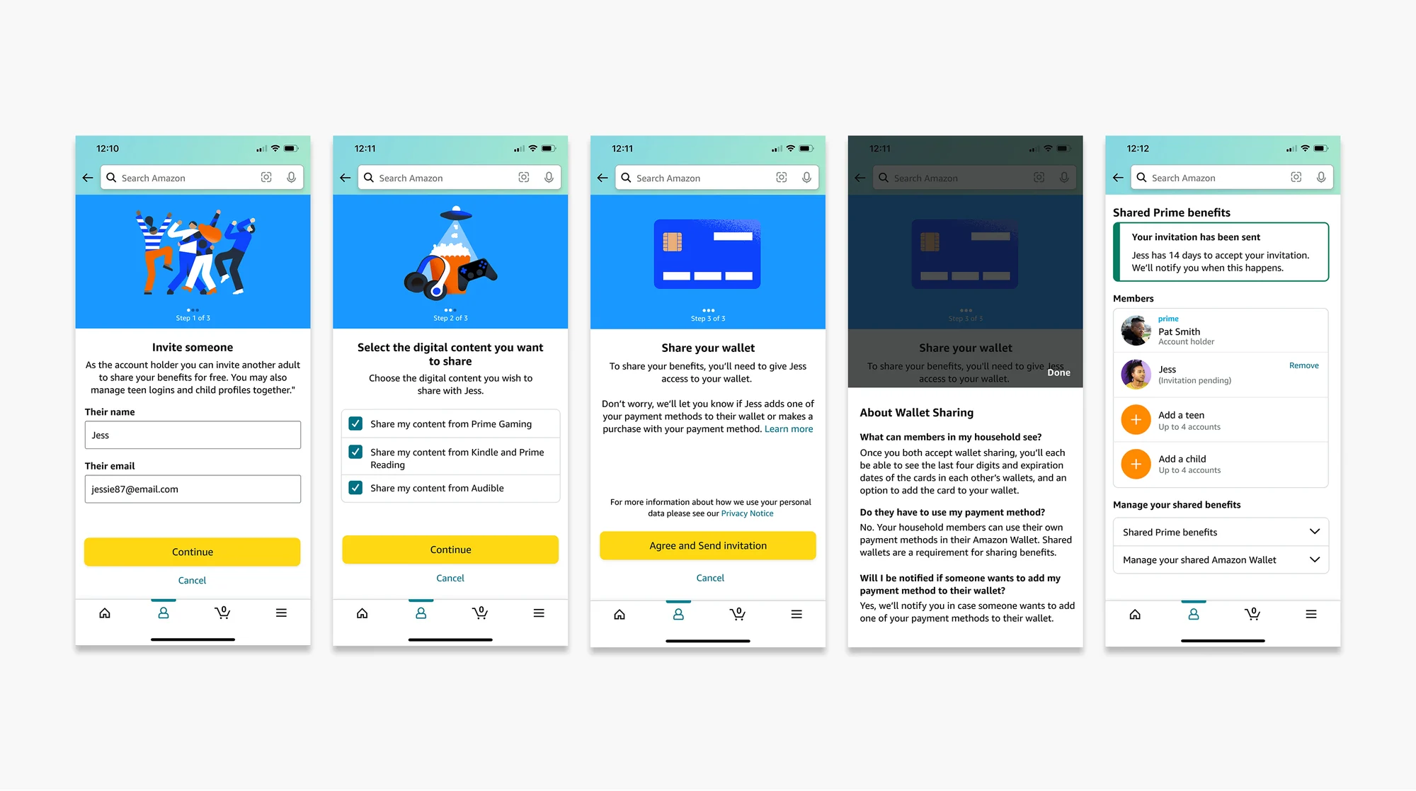
Final testing came in slightly better than the baseline. We agreed with legal to revisit the contract terms when they expire within 5 years and move toward the single payment method.
The impact
Members got clear expectations upfront and simple, friendly copy at every step.
What I learned
I came in to improve adoption and reduce confusion, and research showed the real barrier was trust and setting expectations. It was a good reminder that the problem you're given is rarely the whole story. Journey maps, usability insights and quotes helped move conversations from opinions to evidence.
Confidential information has been omitted or blurred to comply with my NDA. All material is property of Amazon.